Color Theory: Rules and Laws of Color
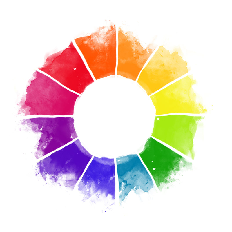
Who Invented the Color Wheel?Color wheel was first introduced in 1666 by a famous mathematician Sir Isaac Newton. He was the first to arrange colors into a circle. Today this perfect blend of art and science is of the best tools to understand the relationships between colors.
Understanding and knowing the color wheel well allows us to:
|
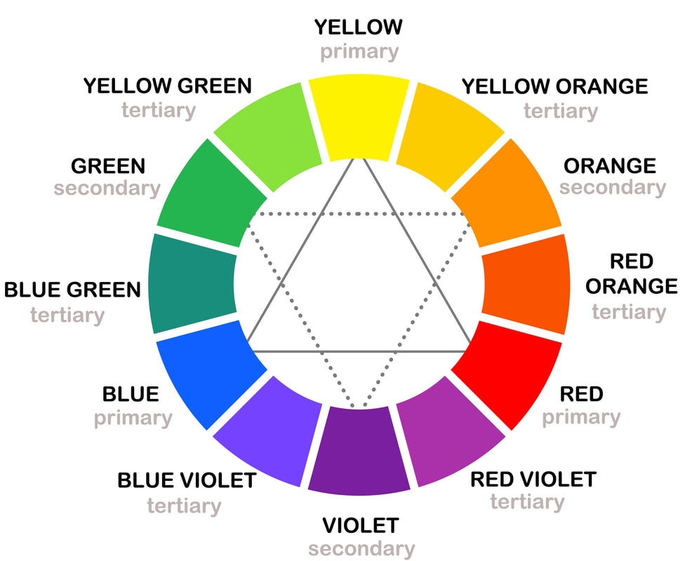
Primary, Secondary and Tertiary Colors12 colors on the color wheel are divided into primary, secondary and tertiary colors.
Yellow
Red Blue These are the primary colors that can't be mixed from any other colors. But they are the only three colors you need to mix the other color combinations. In Color Theory classes students are always asked to create our own color wheel from these three colors only. Try it, it's truly an exciting exercise. Orange = red mixed with yellow
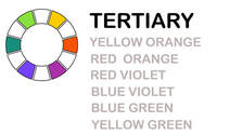
Violet = red mixed with blue Green = yellow mixed with blue You can create tertiary colors by mixing a secondary color with a primary color.
|
Color Harmonies or Color Combinations
The most commonly used color combinations or harmonies are complementary, analogues, triad, tetradic.
|
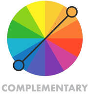
Complementary - 2 color combination
It can be any two colors found opposite of each other on the color wheel. This is always a very bright color combination with high contrast effect. The easiest way to train your eye and learn how to capture those color combinations would be in nature or in our every day life. Red and green would be an example of a complementary color harmony. We often see it in the Christmas tree decorated with red ornaments, red tomato or a strawberry have green leaves, etc. |
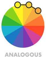
Analogous - 3 color combination
Using 3 colors located next to each other will give you more subtle choice, but it can lack the wow effect and seem monotonous. Using one of three the colors as dominant and other two as contrast colors is usually recommended. Tree foliage would be an example of an analogous color harmony with multiple shades of green in the Summer or red/orange in the Fall. Or a blue sky meeting blue water on the horizon line. |
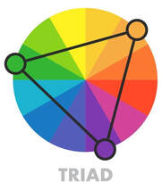
Triad - 3 color combination
It can be any three colors evenly spaced out on the color wheel. This harmony always creates a vibrant effect. It can often be found in nature. Daisy flower for example has a stunning combination of purple, yellow and green. |
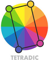
Tetradic (Rectangle) - 4 color combination
It can be any four colors evenly spaced out on the color wheel. Tetradic theme is very bold, rich and vibrant. Like with the other complex harmonies it works best if one of the four colors is dominating and the other three supporting it as details or accents. This color combination will also involve a balance between warm and cold colors. |
Color temperatures
Color wheel is also a great tool to help artists understand and differentiate between color temperatures. Knowing color temperatures is essential for creating well balanced art work and in achieving various psychological effects.
|
WARM COLORS
If you look at the color wheel, all the colors (hues) from red through yellow are considered to be warm colors. The psychological effect of warm colors will make you feel warm or hot, like sun or fire do. Browns and tans would belong to warm colors category as well. Red violet Red Red orange Orange Orange yellow Yellow |
COOL COLORS
Colors (hues) from blue to purple – are cool colors. Water is cold and calm, it relaxes and calms you down. Keep this psychological affect of cool colors in mind when gravitating towards cool colors in your art work. Greys would be your cool colors too. Yellow green Green Blue green Blue Blue violet Violet |
On top of pure warm and cool colors we can have cool-warm color combinations. You can have warm greys and cool browns. Or we can have cool red – raspberry color vs traditional warm red (e.g. fire). Warm green would be lime color, cool green - emerald, etc.
Color vs hue, tint, shade and tone
|
Term “color” is a general term which describes hue, tint, shade and tone.
|
Hue – this would be all the pure colors you’d see on the color wheel (primary, secondary and tertiary) as the term “hue” refers to the dominant color family, to the origin of color human eyes and brain can distinguish. It’s a pure pigment without any additives (e.g. white or black)
|
Tint – it’s a mix of pure hue and white. Tints are created when you need to lighten the color and make it less intense and may give you pastel effect.
|
Shade – it’s a mix of pure hue and black. Shades will help you darken the color and make it richer. Shades allow for more dramatic effect of your art work.
|
Tone – it’s a mix of pure hue and grey (black & white combined). Tones are somewhat similar to tint in making your color look duller and more subtle.
|
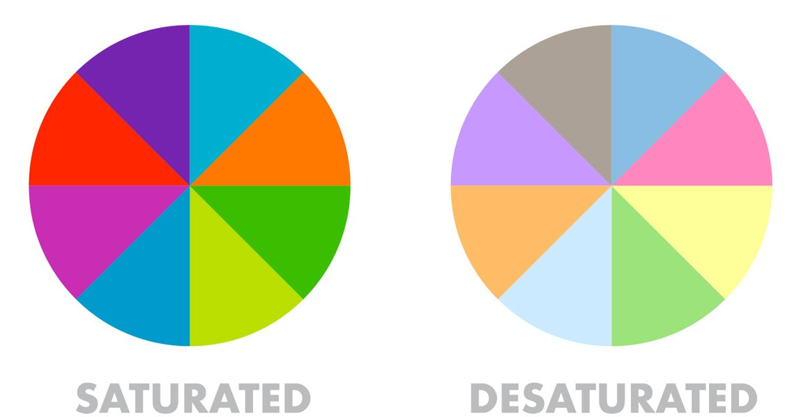
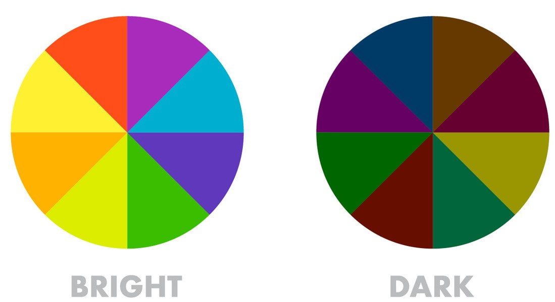
Saturation and luminance of color
|
Color saturation is an indicator of the intensity and vividness of color. If the saturation is zero, you’d see no color, there’d only be white, grey or black.
|
Color luminance shows the amount of light and brightness in the color. It’s the degree of luminance which makes the color appear lighter or darker.
|
